3 Key Tips to Strengthen Your Landing Page
If you are looking to optimize performance in the digital space, you should ask yourself the following questions:
- How do I design an effective landing page for my audience?
- What is the best hierarchy and where should I put the call to action?
- What are the best layouts to generate the most conversions?
You will be forgiven, however, if you think any of these questions have a universal and specific “right answer”—because they usually don’t.
Nonetheless, there are concepts that can be universally applied, and knowing a few key techniques can lead you to some solid results.
Designing For Your Audience
Triggering a response from your audience is a simple idea that is often difficult to implement.
To begin, take some time to better understand your audience—what they like and what they trust. Research before you design and validate your early designs with user testing and analytics. You can also bookmark my other post about user research techniques.
The following examples both focus on money-saving services but are directed at very different age groups.
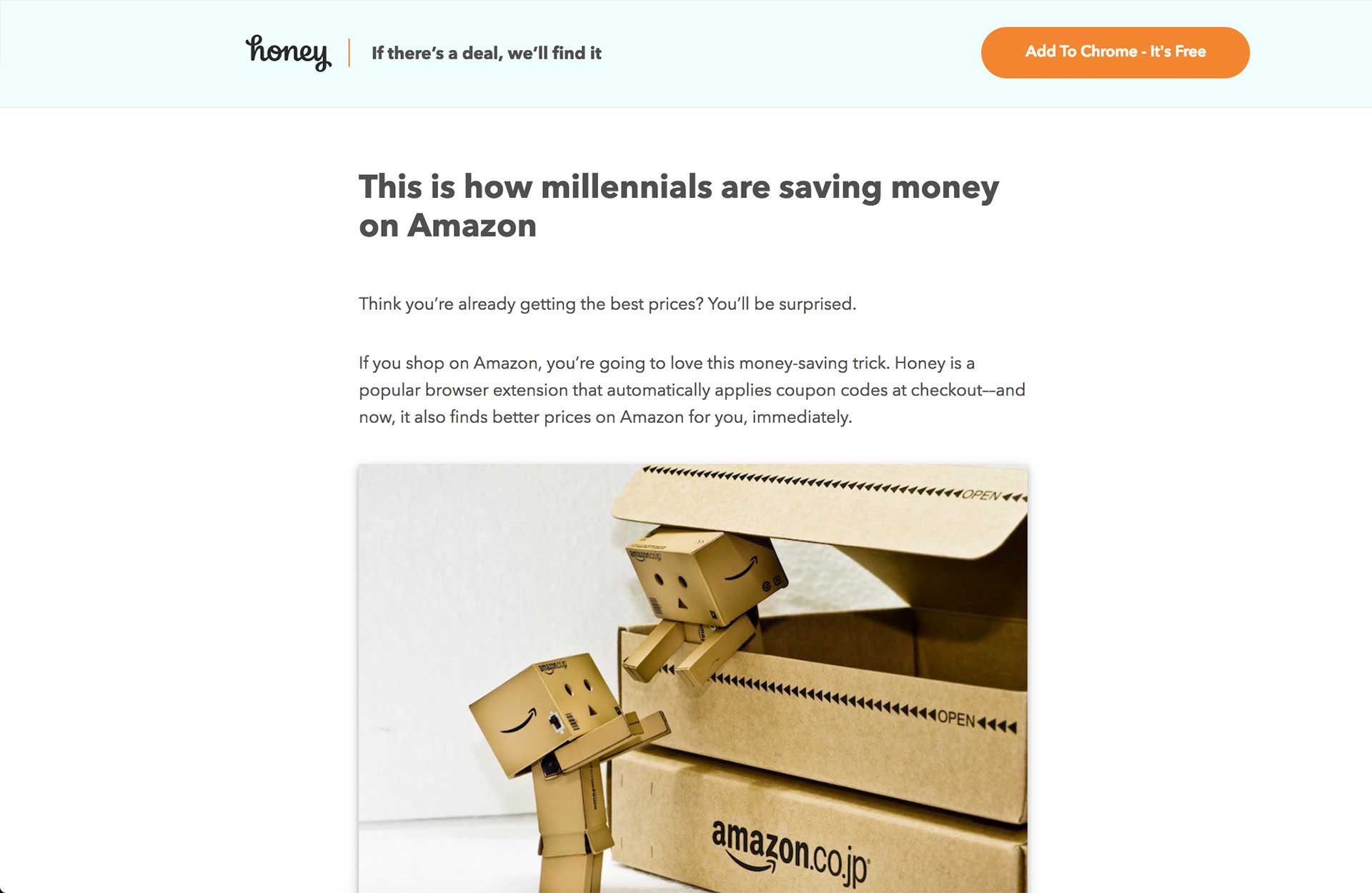
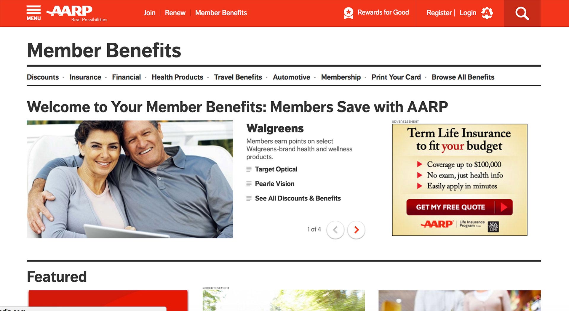
Note the differences in each visual approach. Honey is targeting a millennial audience and has a fairly light touch. AARP is more conventional, appealing to consumers closer to retirement age. Each property understands who their visitors are without trying to simply reach “everybody who wants to save money.”
This understanding has likely resulted in better results for each of them.
Maintaining Hierarchy
Does every visual and text element on your screen help steer the user to conversion? If not, they should.
A good magazine article will use a headline, subhead, body copy, and content highlights to engage readers. Your digital experience should use elements in a similar way.
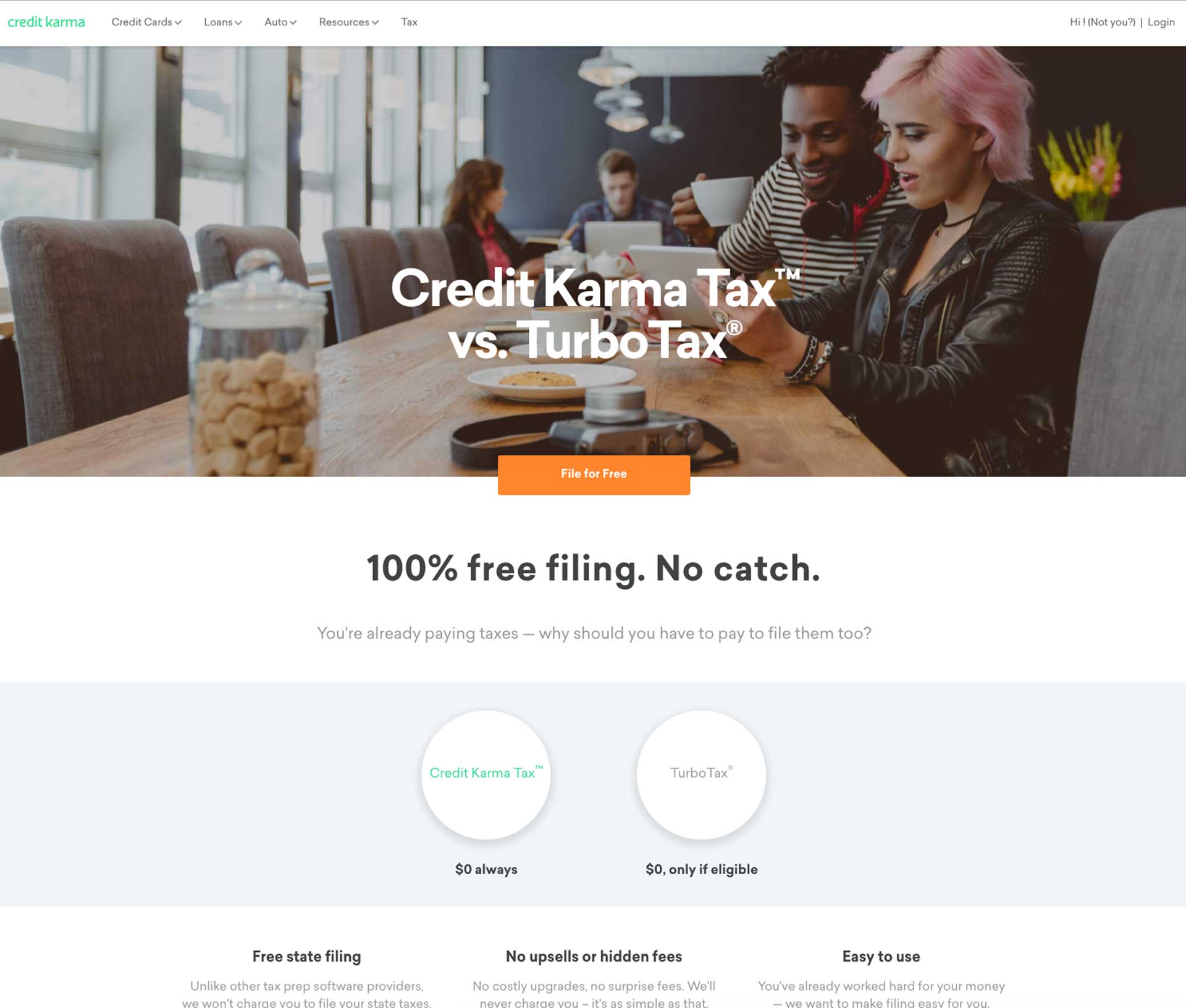
This Credit Karma Tax landing page illustrates the idea. Note how it arranges its building blocks in a clear order with user actions in mind.
- The image instantly communicates who should take note: forward-thinking people who may value new products like Credit Karma Tax.
- The “Credit Karma Tax vs. Turbo Tax” headline quickly conveys that the product is similar to Turbo Tax, a well known and older rival.
- The bold subhead—“100% free filing. No catch.”—efficiently informs the visitor what’s in it for them. It is smaller than the headline so it doesn’t compete.
- The orange “File for Free” call-to-action box is short, action-oriented, and informative.
- Supporting information for interested viewers is presented in a carefully balanced manner throughout the page.
- Even though the menu bar is at the top of the page, it is small and does not compete for attention. Credit Karma doesn’t want a prospect to get distracted and fall out of the funnel, but a returning user could find these links useful.
Every element on the Credit Karma page supports the desired user action. Does your landing page do the same—or is it displaying a conflicted experience to your prospects? Be on the lookout for compromises that may render your landing page less effective and insist that the on-screen elements deliver an unmistakable path to conversion.
Patterns and Consistency
Online conventions exist for all kinds of experiences, from forms, to navigation, to calls to action. They keep users from having to reorient themselves each time they visit a new site and are generally good for conversions. So be cautious if you find yourself reinventing common patterns.
Of course, deviations from the functional norm are not forbidden, but they should be treated as risks. Test them carefully to be sure you aren’t confusing your users.
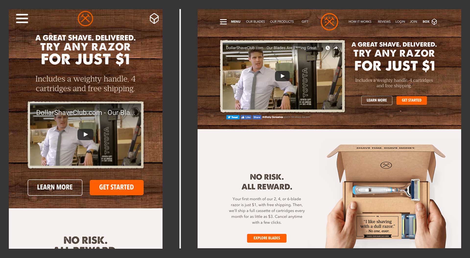
For example, this landing page for Dollar Shave Club is distinctive but not confusing. There’s a slight twist on the shopping cart: The company calls it a box. But it’s still at the top right as expected, and has undoubtedly been tested with core users to ensure it is understood.
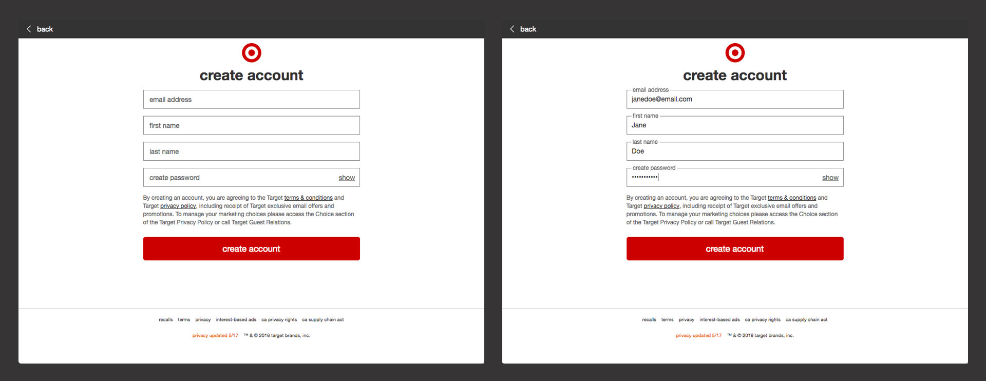
Target accomplishes the same thing with this signup form. At first glance, the function of the screen is familiar to prospects based on years of internet conventions and expectations. But it’s unmistakably on-brand for Target.
To research common design patterns for your project, check out UI-patterns.com and be sure and review experiences similar to the one you want to create.
A side note: Internal cross-channel consistency is also important.
When you have multiple screens and touch points on various devices, it’s critical to consider your multichannel experience as one ecosystem. It will function better and feel more trustworthy to your visitors.
More Best Practices
In addition, there are other tips worth calling out. However, it is always important to keep the broader concepts in mind—and keep testing in case some of these don’t work in your instance.
For landing pages:
- Match the headline on your link with the one on your landing page
- Give each landing page a single purpose and a single message
- Show your product in use
- Keep it short
- Social proof works well except when it doesn’t
- Offer free trials and guarantees
- Show your phone number
- Landing pages are more focused than home pages
Source: Unbounce
For digital forms:
- Fewer fields is usually better
- Keep labels close to their fields
- Use one column
- Display which fields are required and which are optional
- Make error messages bold and clear. Color is not enough to differentiate them
- If you need more complexity, consider multi-step forms
Source: Nielsen Norman Group
To Wrap Things Up
Hopefully this post will encourage you to take a step back and reconsider your viewer experiences at a fundamental level. Start by uncovering more about your audience, and applying time-tested principles to your work, like hierarchy and the use of established patterns. By combining these steps with solid testing, you could start to see your conversions steadily improve.


