Unfortunately, there’s no magic recipe when it comes to creating highly engaging and converting content, but we do have some helpful tricks to share. Read on for our content best practices, and to review our general advertiser guidelines, please refer to this article.
Title Best Practices:
- Outbrain supports titles up to 100 characters. However, we recommend 60 characters or less, as the message is truncated beyond 60 characters.
- Use questions to encourage engagement
- Example: Looking to invest your money? Read here for advice
- Include numbers when relevant, specifically odd numbers (10 and under)
- Example: 5 Powerhouse States Reducing Emissions from Power
- Try using dynamic headlines to personalize the user experience. Dynamic headlines can be location-based or include day-of-the-week
- Example: ${city}$ Loves This Mattress
- Example: Sale on Cars This ${dayofweek}$ at New York Auto
- Include your target audience in the headline to pre-qualify users without reducing your scale
- Example: Millennials: Are you looking to buy a house?
- We recommend including 3-4 title variations in order to test which versions drive the strongest performance
Things to Avoid in Titles:
- Do not promise anything in your headlines without a trusted resource
- Example: 9 Out of 10 Doctors Recommend Our Product (with no data/hard facts)
- Excessive or missing capitalization
- Example: “LEARN MORE” — A correct replacement would be “Learn More”
- Inaccurate, misleading, or overly sensational headlines
- Example: Surprising Trick that Eliminates Belly Fat
- Negative or extreme words such as “never” and “worst.” Positive, less acute words tend to perform better
Image Best Practices:
- Dimensions: 1200 x 800px is the recommended image size
- It’s recommended to use a 3:2 image ratio for Standard campaigns, and a 1:1 image ratio for Carousel and App Install campaigns. View our dedicated Carousel and App Install Help Center articles (hyperlinked above) for detailed creative instructions
- Always use a high-resolution image
- Lifestyle images tend to perform better than cartoons or stock images
- If you’re promoting a product, try including it in the image – something tangible that’s displayed in an attractive way encourages consumers to click
- Portraits work better than people in action
- Try using close-up images rather than wider shots
- Use images that portray your audience or relate closely to your landing page content
- Utilize relevant brand attributes such as colors, especially if they are unmistakable (such as T-Mobile’s signature hot pink)
- We recommend including 3-4 image variations (depending on budgets) in order to test which versions drive the strongest performance
Things to Avoid in Images:
- Images that contain text within (including promotional messages)
- Images that are unrelated to the headline and/or landing page
What image formatting options can I use?
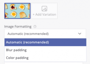
Outbrain offers 3 image formatting options:

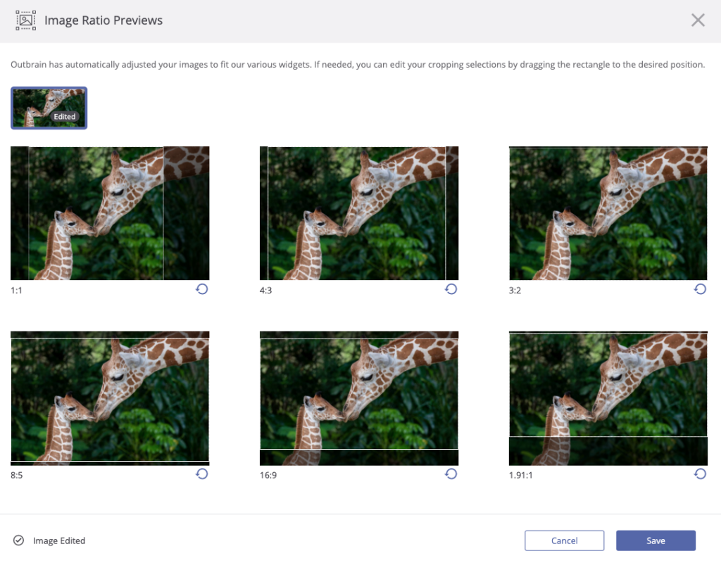
- Automatic (recommended) – This default option is the usual way of treating images according to the various widgets’ aspect ratios across our publisher partners. The “Ratio Previews” allow you to view all of the various layouts your creative will appear in across the Outbrain network when uploading content. Because Outbrain placements are tailored to create the most native experience for each of our publisher partners, your creative may appear in various dimensions and ratios. Outbrain employs a service to automatically detect the prominent features of your images and format them within placements accordingly for the optimum user experience. If you want to select yourself the way your images are being automatically adjusted according to each ratio, you can use the Image Editor.

Simply drag the dotted rectangle to the desired position on your image. This provides you with full control over how your brand and creatives appear across the Outbrain network. - Blur padding – The blur padding option adds blurred borders to an image, which eliminates the need to crop it due to the different widget ratios.
- Color padding – The color padding option takes into account the border color from an image and adds colored borders to it, which also eliminates the need to crop it due to the different widget ratios.
Both the blur padding and color padding options are great solutions for users who have high attention to how their creatives appear across our network, have some text or a logo on their images and want to ensure it will always be displayed, or need additional assurance on brand safety or suitability concerns.
TIPS:
- If there’s no logo or text on your images, the default image option (Image cropping) is highly recommended.
- In case you’d like to avoid cropping on your images, use the color padding option if your image features mainly one color; if your image features many different objects and colors, it is best to use blur padding
Please Note – Any manual adjustments you make to your image cropping will be saved to the image for future use — meaning your image will appear in your desired ratio if it is used in additional creatives or campaigns.
Landing Page Best Practices:
- Always lead to relevant landing pages to avoid high bounce rates
- Limit “click out” opportunities such as ads and pop-ups that drive away from the main goal
- If your goal is to generate sales, drive directly to product or service pages
- For brand awareness, leading to earned media tends to perform well
- For conversion-focused goals, include strong and clear calls-to-action (CTAs)
Carousel Best Practices:
- Create Carousels with 3-5 cards maximum, as users tend to drop off after that
- Test different CTAs
- Lead to several landing pages within the Carousel
Video Best Practices:
- For longer-form videos (:30-5:00), Click-to-Watch video works best because the user signals they are in consumption mode by initiating to view. Please note, Click-to-Watch video is only available for fully managed accounts
- For shorter-form videos (:05-:30), utilize Outstream video (only available via Zemanta)
For all campaign best practices, please refer to this Help Center article.